
The Web Layout Revolution: An Interview with Chen Hui Jing
Chen Hui Jing is a self-taught designer and developer with an inordinate love for CSS. She used to play basketball full-time and built her first HTML website for the Malaysia Basketball Association in 2008. It was only five years later, however, that she properly launched her web career and got a job in the industry.
Hui Jing is now a sought after speaker at conferences, co-organises Talk.CSS (a meetup around all things CSS in Singapore, where she lives), and recently joined Nexmo as a developer advocate. We caught up with her to talk about an area of CSS she’s especially passionate about — modern web layouts.

What’s intrinsic web design?
Intrinsic web design is a term coined by Jen Simmons and revealed to the world at large back in during a talk at An Event Apart last year. It encompasses a paradigm shift when it comes to thinking about web design. If you google “intrinsic web design”, you’ll see quite a few articles that summarize Jen’s presentation (which I highly recommend everyone to watch) into six principles, but I think it’s more than that.
What I mean by paradigm shift is that the mindset around designing for the web needs to evolve, because unlike any other medium used for visual communication, we will never be able to predict where and how our designs are being viewed. We have to accept this, then embrace it. While CSS has evolved to allow us to almost match what can be achieved on print, we have to be cognizant of the unique aspects of the web as well.
We now have tools that were created specifically for layout on the web, like Flexbox and Grid, that embrace the unpredictability of where and how our designs will be viewed. The web was invented as a means of sharing information, a place where content is king. Today, we have the CSS to implement content-driven designs, which can adapt to any viewport (The viewport is the user’s visible area of a web page). It’s more than just a specific CSS property, it’s about combining all the different CSS properties available to us to achieve this.
How do we break out of the boring cookie cutter layouts so commonly seen on the web?
By truly embracing the nature of the web and accepting that designs do not have to look the same across every device and browser. This change in mindset allows us the freedom to experiment with newer features for browsers that support them while providing a different design for those that don’t.
In order to do that, we have to really understand how CSS works, and how the browser renders things. CSS is not black magic, even though it has garnered a reputation among some developers for being unfathomable. Rachel Andrew recently published an article called “The way we talk about CSS”, and it really resonated with me. Particularly this quote:
There are things in CSS that are not intuitive, or seem at odds with the rest of the system. Many of those are due to legacy reasons and the fact we can’t break the web, however they can be read about and understood.
Perhaps things move too fast in our industry that some people feel they don’t have the time to learn all the things. But spending time on key fundamentals like HTML, CSS and vanilla JavaScript is an investment that will pay dividends down the road. And it will make it easier to pick up newer web APIs as they are being released faster than ever, while still being able to provide elegant fallbacks for older browsers.
What impact does box alignment have on layouts, and how can we start using it?
The Box Alignment specification was drafted in 2012 because, with the development of newer layout methods like Flexbox and Grid, there was a need for a cohesive and common box alignment model across all formatting contexts. For now, box alignment properties are applicable to only the flex formatting context and the grid formatting context, but the end-goal is to have them in use for block formatting contexts as well in the future.
Before box alignment, the properties we had for aligning content were confined to the inline-direction. For example text-align for inline-content, and use of margins for centring block boxes. But we did not have anything available for proper alignment along the block axis. Given the default writing-mode for content on the web is horizontal top-to-bottom, aligning content vertically was the bane of many developers.
Box alignment properties give us the tools we need for aligning content in two dimensions. If your items are laid out with Flexbox, you have four box alignment properties at your disposal: justify-content, align-content, align-items and align-self. If you are using Grid, then you have two more box alignment properties: justify-items and justify-self.
A good way to remember which axes they apply to is what I call the “Microsoft Word” memory trick (or any GUI text editor, actually). Whenever we want to justify text, we look at those four icons somewhere on the toolbar and they shift the text along the inline-axis.

If justify moves things along the inline axis (left-to-right, if you’re using a language like English), then align must move them in the perpendicular direction.
For the latter half of each value, think of *-content as aligning the parent container, while *-items is concerned with the alignment of child items within the parent container. *-self is an override of individual child items, so behaves exactly the same as *-items but for a single child item only.
If anyone is interested, I gave a talk on Box Alignment at CSS Day last year, check out the slides and watch the video:
Turns out using illustrated boxes to explain box alignment concepts resonates with people, who knew?
How can CSS improve the way we layout text on the web?
There is an increasing number of CSS properties these days that allow us to make finer adjustments to how text is typeset on the web. According to design legend Cipe Pineles, typography has been roughly defined as the arrangement or organization of text and other visual information on a printed page.
Good typography holds readers’ attention allowing them to absorb information better, by making the reading experience more comfortable. CSS gives web designers the ability to access OpenType font features which can help in this endeavor, like the various font-variant properties, and font-feature settings.
Newer developments like variable fonts allow designers to better typeset content for dynamic viewports, providing a great experience optimized for the screen used to view it, while ensuring that performance is not compromised.
There are a lot of great demos out there but how can we use these techniques in real client work?
This ties back to the earlier point of accepting the fact that designs do not have to look the same in every browser or device. Once we can establish that understanding with the clients we are working with, there is a lot that can be done. Understandably this may be the trickiest part, but I believe in the power of showing real-life examples in the browser versus static mock-ups. Adjusting the viewport live, and watching the content flow into place can help when you’re making your case against a fixed design.
If we can get the client on board, my go-to strategy revolves around feature queries, aka @supports. This CSS property allows us to do feature detection with native CSS, which means that if a browser does not support a particular feature you want to use, the entire code block within the query will be ignored. We start off with a base of styles relying on tried-and-true layout techniques, like inline-block or floats. Then layer on styles based on the new feature we’d like to use below, making use of the cascade. When done right, we will be able to provide a usable and pleasant experience on basic browsers, while presenting enhanced layouts on the latest browsers.
The website for Wismut Labs utilises such a technique: a browser that doesn’t support feature queries still styles the site properly (it’s just a bit basic), while browsers that support Grid get a slightly enhanced design and browsers that support CSS Shapes get yet an additional enhanced component. This is what I mean when I say building for feature support, not browser support. And the best part is, once a browser updates, you don’t have to modify your codebase, the enhanced layout is automatic.

What’s your favorite example of a site using a unique layout at the moment and why?
One of the CSS properties that I’ve enjoyed exploring is writing-mode, which addresses vertical writing. As a native Chinese speaker, and member of the Chinese Layout Task Force, it is important to me that Chinese can be correctly typeset on the web. But it also highlights how overwhelmingly skewed the online and digital world is toward English, and one of the ways to rectify that imbalance is to improve typesetting and layout capabilities for all different writing systems and scripts.
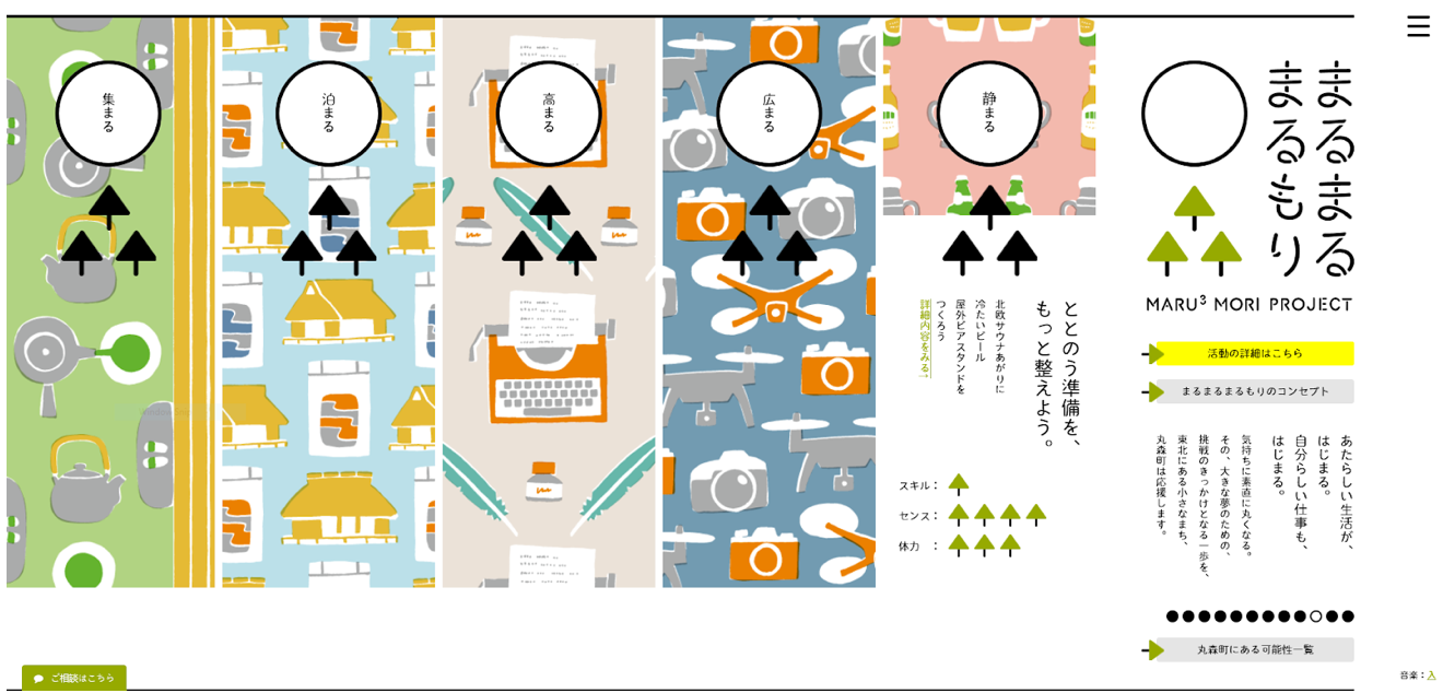
East Asian languages have the advantage of being legible in both horizontal and vertical directions, which is why mixed writing-mode layouts, like the website for the Maru3 Mori project, really appeal to me.
That being said, even though vertical writing applies only to East Asian languages, there is nothing preventing designers who work in other languages from utilizing vertical text for art direction.
How do you learn new web technologies?
I try to cast a wide net in terms of things I’m exposed to, by subscribing to RSS feeds, listening to podcasts, following people on Twitter who are in the thick of developing new technologies. And I don’t try to learn everything I come across, the point is to have an idea of what is possible, and what is available. Because there’s simply too much new stuff coming out everyday that it’s easy to get overwhelmed if you try to do that.
It’s like building an index of new web technologies, and only diving deep into a particular thing when whatever you’re building calls for it. Personally, I find it easier to go for breadth on a day-to-day basis, then really going deep into a specific technology when you have to implement it. However, if you come across something that sounds interesting, maybe a new API or CSS property, build something simple with it, just to play around and see what it can do. Some of these demos can grow into side projects or even code snippets you can come back to for bigger jobs or projects.
To find out more about Hui Jing, check out her site, which includes samples of her work as well as all her conference talks (videos and PDFs).
Your beautiful web layouts have a home at Media Temple. Check out our web hosting plans for developers and designers, spanning shared hosting to managed services for the AWS Cloud.

