Seven UX Design Misconceptions That Simply Aren't True
As more experts and enthusiasts flood the UX world each year with new ideas, processes, and proposed regulations, it has become more and more difficult to discern legitimate modern UX concepts from fluffy ones. A career in user experience involves creating designs, making tough choices, and, most importantly, learning from one’s mistakes. After all, one can build a design around the idea of fixing mistakes. While a new idea might sound appealing, it does not make it a true UX standard. More often than not, mistakes become designs.
Have we been exposed to too many fancy concepts that simply aren’t true? Here are some of the common misconceptions and mistakes found in modern design and how to avoid them.
1: UX equals UI
A user interface is like a joke. If you have to explain it, it’s not that good.
There’s still a lot of confusion out there about the differences between User Experience and User Interface designs. This first misconception needs separation, once and for all.
User Experience Design
1: A set of rules and a list of development processes that improve the quality of interaction between the user and the business itself.
2: Involves work in areas such as content, testing, development, research, and prototyping to measure results.
3: A cognitive science practice that is used exclusively by the digital market.
User Interface Design
1: Tuning a product’s user-interface to reflect the strengths and visual resources for the best possible user-experience.
2: A system for conveying a visual roadmap of the product’s features and usability options, through the use of digital design elements.
3: Requires the assistance of code developers to integrate and optimize.
With such defined differences, there’s no instance where they should be confused. It’s also easy to understand why both should work together. Suppose you have a great product that has a marvelous design. If it turns out to be hard to use, that’s a sign of bad UX. In other cases, something might look very shallow, and yet have great usability futures. So the UX is good, but UI bad. Balancing the two is essential.
2: Carousel = Pageviews
This misconception is a bit ambiguous. Using a carousel to display content does account for more pageviews. However, it also increases user frustration and a long-term loss of total site visitors.

At first, a content carousel appears like a good idea. It’s a way to display a lot of content without taking up too much space, right? An interesting tweet from Luke Wroblewski, states that less than 5% of actual site visitors will click beyond the first two slides of a content carousel.
On top of that:
• Carousels often “hide” what’s on the next page, leaving the user to aimlessly browse until they find something interesting.
• Auto-rotating carousels are difficult and inefficient for readers. Since everyone reads at different speeds, having the page automatically change can frustrate users.
• As such, content carousels aren’t ideal for content consumption, allowing users to skim over it without a chance to soak in the experience.
While a content carousel has visual appeal, the overall browsing experience of such a widget will inevitably be unpleasant.
3: Mobile Apps for a Mobile Experience
Something is happening in the mobile ecosphere: Businesses are shelling out dollars to have their website ideas built into apps. This growing trend is, of course, completely unnecessary.
Mobile app integration should be the secondary choice after a great mobile web browsing experience. For example, someone sends me a link on my phone (pointing towards an unknown website). Upon arriving on that website, I receive a message of Please download our mobile app to browse this content… No, thanks. And when a website claims that their current website is not optimized for a mobile experience − what kind of an excuse is that?

It’s really not that difficult. Treat users with respect, and they’ll do the same to you. Forcing them to download applications to browse your content is a sign of disrespect.
4: Old Content is Old
The word “aged” may be more appropriate. Whether you’re re-building an old (pun intended) site or creating a new one from scratch, chances are that you’re going to take content with you. Particularly from the site from where you started doing the re-design work.
Don’t ignore your old and potentially outdated content. You don’t yet know if it could be a huge burden or a huge opportunity for your site. Your old pages might also be where the majority of your audience lands. — Reid Bandremer
For most content creators, it’s a general rule that older content should remain untouched. Yet, this content is often driving traffic from organic sources. Overlooking this fact will make the old content self-destruct after the whole site design has been drastically changed.
Here is how to solve this problem:
• After new design has been set in place, gather all your content pieces back together.
• Analyze the content types and styles you’re using. Ask yourself: Is the new design intuitively adapting to these changes?
• Check image sizes, custom elements (such as quotes, notes, etc.), and design elements to ensure they work with the new design.
• Finally, re-optimize everything to look fresh and in-line with the design changes.
At its core, content is user experience. Not making the appropriate content changes when a new design is put in place is ignorance, and will result in a bad user experience.
5: Market-based Design
Material design is sweeping the design community off its feet. We’ve seen some great integrations already. The new Lite framework makes this accessible for everyone.
There’s no denying that material design looks great. Just take a look at this StackOverflow material design concept to have your eyes melt in awe. That being said, making drastic changes to your design based on trendy designs can be a costly venture (not just in terms of hiring costs, but the cost of losing revenue).

Avoid making sweeping changes to your design. Instead, begin with simple tests and integrate changes step-by-step. This process will eventually lead you to the design you desire. Remember: Once we change something for good, there’s really no quick way to go back.
6: What About Performance?
The actual performance about our designs should not be overlooked. While it’s fun to explore the latest developer tools , they’re not necessarily optimized for performance. The excitement of having a cool feature is great. But it can overshadow the necessity of performance.
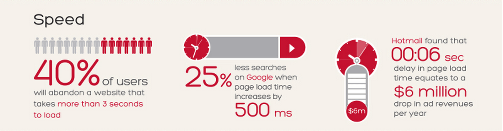
You can view the rest of the infographic on the NCC Group website. Pay close attention to the tools and methods you use for building websites, and closer attention to the overall performance of a design. This is preferably done at each stage of a significant design improvement.
Be authentic. Don’t force your users to endure a slower browsing experience in exchange for a balloon taking off from the bottom of the page!
7: The End is the Beginning
More often than not, the best way to begin a new design is to start from the ending. It’s a common understanding in the UX community that instances such as email signups, checkout pages, sales pages, and contact forms are the places to start your design. While not a totally bad thing to do, there are better ways to approach this.
The problem is that we don’t assume the role of an average user. Instead, work begins from the perspective of conversion rates or other UX metrics. Fixing this is quite easy: Acknowledge the common issues of onboarding / sales processes and focus on experiencing the design from the perspective of an average user.

That’s right. Sit down and try to interact with our website from the perspective with fresh eyes. Not as a designer or developer, but as an average user. Analyze and pinpoint the effectiveness of the design features that you’ve integrated in your site. After that, assess how they feel to the user instead of how they look (or work) from your perspective as UX designers.
When all is said and done for the web experience, repeat this on mobile. Frankly, there is no better way to test something than walking in the shoes of an average user.
What other UX misconceptions do you find everywhere? Leave them in the comments section below!