The Creative Minds Behind Media Temple’s SXSW Art
From our website to our Account Center to our swag bags, the Media Temple creative team puts their heart and soul into creating a simple yet beautiful aesthetic. More often than not, we collaborate with other designers and creatives — and especially when it comes to designing killer art for the SXSW Interactive Closing Party that we’ve been producing for the past few years.
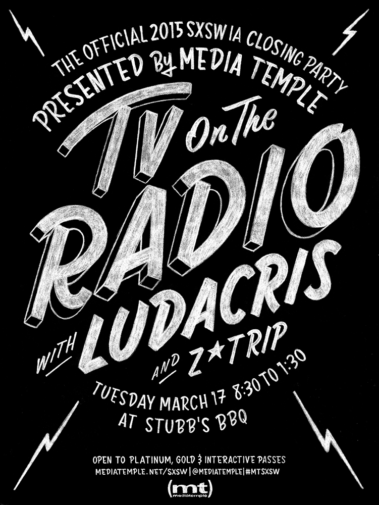
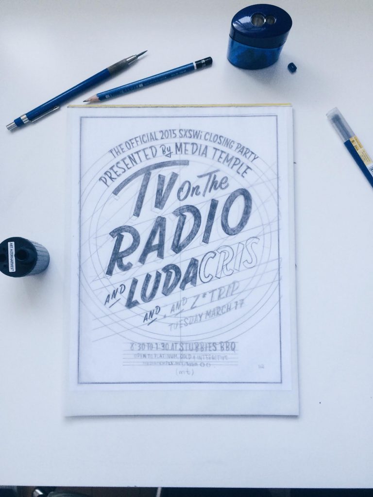
This year was no exception as we turned to Drew Melton, a Los Angeles-based designer whose lettering and typography is known worldwide, to design our party poster. We asked him and Jon Setzen, our creative director, a few questions about the creative process behind the poster.
Drew Melton:
For this poster, where did you draw your inspiration from?
In all honesty, Jon and I discussed more about what we didn’t want the design to look like. Visually, we drew inspiration from chalk signage and modern, catchy, lettering mockups. Since SXSW is such a competitive visual landscape, we knew that getting attention meant scaling back to two colors and keeping the design both bold and playful. We also knew it couldn’t be western or too ornate. People had to be able to read it quickly. It was a great challenge having to be creative with less.
Can you talk about how you actually created the poster?
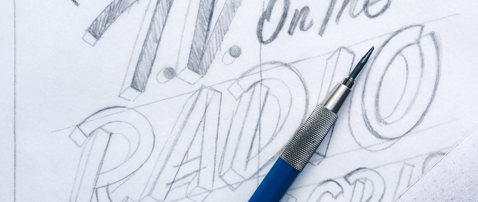
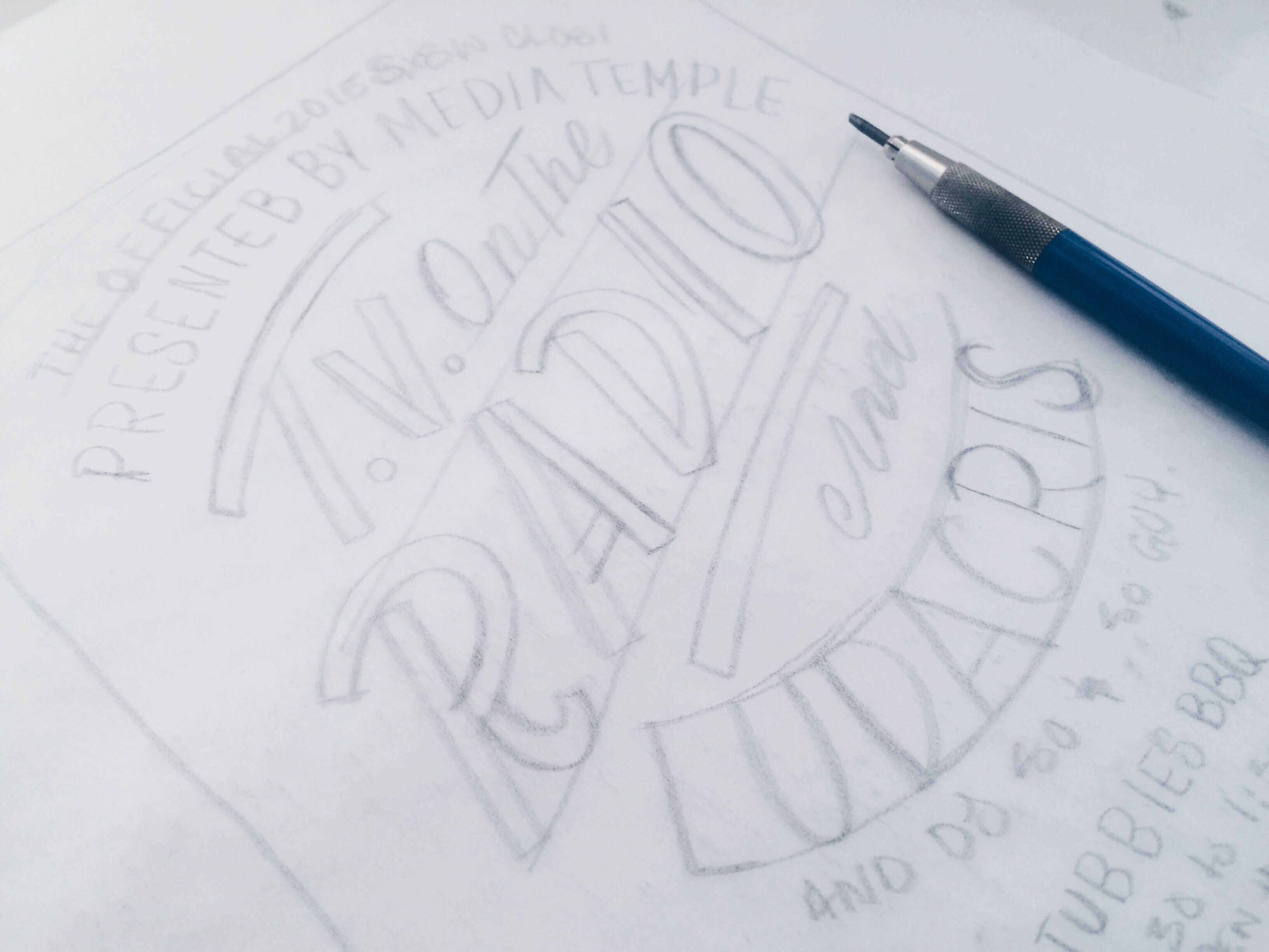
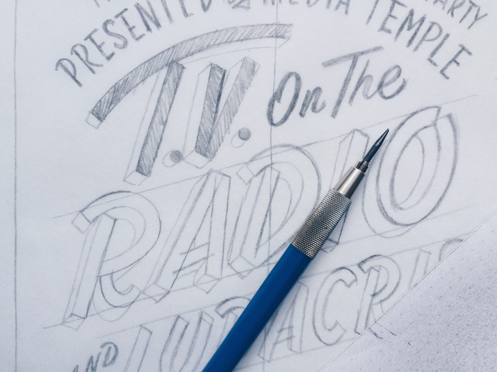
This project was entirely done by hand. The readability of the band names was incredibly important, so we started with really basic, rough sketches to lock down the layout. From that point on, it was all about iteration. I probably drew this poster out 30 times from initial sketch to final scan. There was a lot of refining by hand on this project because we knew the final product would be hand-drawn. It had to be crisp, so I had to consider the pencil I was using because different leads translate differently when inverted. Any adjustments had to be redrawn, scanned, photoshopped in, etc. It was labor intensive but, to be honest, I would much rather do it by hand than design in Illustrator for two days. The final result is compelling and unique. I’m proud of making things with my hands.
Jon Setzen:
What was the idea behind this year’s SXSW poster?
If there is one project I look forward to all year, it’s working on our Closing Party poster for SXSW in Austin, TX. I spent years designing rock posters in NYC, so going through that process is kind of like revisiting an old, wonderful friend. SXSW is visual chaos, with no restraint in design landscape. It is colors on top of colors on top of predictable Western themes, complete with a smattering of logos. So each year, we try to do something very different from what else is out there, erring on the side of simplicity.
I knew that, based on the fact that TV On The Radio were our headliner, I wanted to do something black and white and only typographic. Something about their name and sound worked perfectly with that aesthetic. I wanted their band name to leap off the page is an artistic and unique way. We canvas the block around Stubb’s BBQ before the show, so I am always thinking about how it is going to look and how it is going to look when people Instagram the poster hanging out around town. It needs to stand out, and stand out for the right reasons.
How did you choose work with Drew Melton?
When I decided on the overall direction for the poster, I really only had one person in mind: Drew. I had recently worked with him on another branding project and it was a great experience. He took my little idea and turned it into an incredible logo. He’s as good as it gets when it comes to custom lettering — and I don’t just mean his skill level, but how easy it is to work with him. It was simple. We chatted a few times, I showed him some reference pieces, and I just said that I wanted it black and white, bold and minimal. He sent over a few sketches and one completely stood out. It was the winner before he even inked it. That kind of understanding between client and designer is rare, but when it happens you just run with it. It’s magic. That was made obvious by watching countless people all over Austin carefully tear down the poster, roll it up, and carry it away with them.