Behind the Poster with Dan Stiles
SXSW Interactive remains a multimedia experience to behold. But outside of the app demos, interactive activations (Westworld, anyone?), and keynote speakers, there remains one constant: The posters that overwhelm the streets of Austin, the convention center, and nearly every tapped and untapped space on 6th Street.
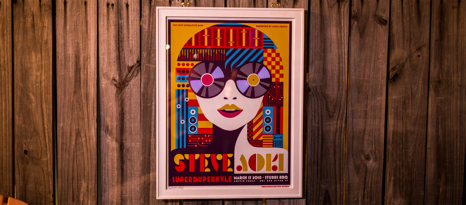
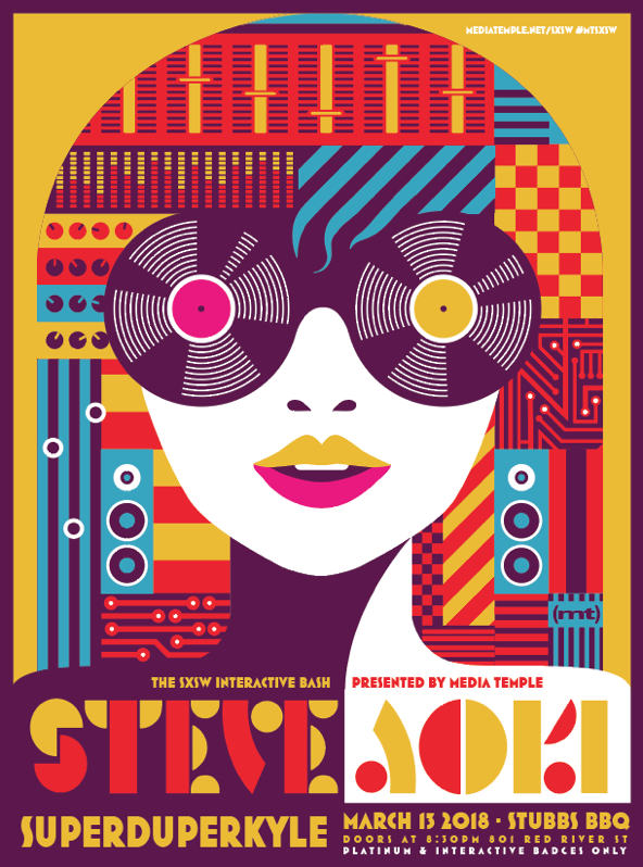
For our SXSW Interactive Bash, we make it a point to collaborate with some of our favorite designers or design studios across the nation to create a poster that not only speaks to our presence but the incredible personality of the musicians and the SXSW audience. This year, Dan Stiles got the call, creating a poster that blends both the digital and human touch into a vibrant and sumptuous visual experience. We asked him a few questions about himself and the creative process of making concert posters.
1: Tell us about your early days of making concert posters. How did it all start?
My love affair with posters started in high school. I used to pull punk flyers off of telephone poles and tack them to my bedroom walls. By the time I moved out they were layered three deep. Once I got to college, I was invited to make posters for the campus venue. They offered me $20 a pop, free admission, and all the beer I could drink at the show. It was an offer I couldn’t refuse. As a huge music fan it gave me a chance to be a part of the scene, even as a non-musician. I got lucky in that I was in the Pacific Northwest in the early 90’s where all the good music was happening. It was really the first time in my life that I realized artistic ability was a skill that not everyone possessed. I had never really considered my interest in art and design as anything commercially viable before that.
2: What major trends have you seen in concert posters over the years?
Poster art goes in waves. Most people are familiar with the psychedelic posters of the 60’s. But after that the scene died, punk came along, which brought us the totally punk rock xerox flyer with cut-and-paste deliberately offensive graphics. That was my first introduction to the form. By the late 80’s it had died off again only to be resurrected by the grunge movement in the early 90’s, specifically as the screen printed rock poster that you might be familiar with today. Between then and now what we’ve seen is a slow professionalization of the form. Poster designers used to be people who worked the door or maybe behind the bar at the venues who made the posters in their spare time. It was very wild west. Over the past 20 years we’ve see more and more mainstream interest in the form, and more and more trained artists and designers getting on board. It’s less of a DIY in your basement thing these days. More often than not, now it’s a top-notch poster commissioned by the band that they sell in the merch booth after the show for $30 or $40.
3: Where do you pull your inspiration from?
I could fill a book with my influences. Most important in the fact that I love ephemera. I am not a fine artist moonlighting as a designer. I love weird pop culture trash first and foremost. Old comic books, signs, and advertising. Album covers, skateboards, and Tshirts. That’s the material that really does it for me. But my interests range way beyond that. I love modernism, Japanese design, experimental typography, art deco… I could go on forever.
4: Walk us through the design process for the SXSW poster.
Humans love symbols, and we all speak symbolism a second language. This has become very apparent with our modern use of emoji, but it dates back to our earliest ancestors painting animal forms on the walls of caves. My process is largely about finding symbols that will resonate with the viewer in a way that tells the story of what they’re going to hear when they get to a show. I try to explain in pictures how a show is going to sound, how a product is going to feel, or what a book might be about. The process starts with research. Learning about an artist, listening to their music if I’m unfamiliar. Then I begin collecting symbols. For instance, Steve Aoki is a DJ. The record, in spite of the fact that it’s a bit tired and trite, is an appropriate symbol here. Mixing decks, technology, knobs and circuits, the listener, Aoki’s Asian heritage, I pull it all in. Then when I have a kit of parts, I begin to assemble those symbols in new and novel ways to tell a story.
5: This year we have something new. The Electric Poster. Can you tell us more about this?
The Electric Poster is an experimental design form that arose from my desire to see what more could be done with the medium of the poster. We’ve been doing ink on paper for 500 years and everyone keeps saying print is dead. Staring at our phones is supposed to be the future. I asked myself if there was some way to combine modern tech with old school graphic design. So much cool tech has been developed in the last decade like conductive inks, OLEDs, and cheap micro controllers. I wondered if there was a way to take all this tiny technology and blow it back up into the scale of a poster? Could we take what has become a personal digital art experience and make it a form of public art again? The answer turns out to be yes, you can use technology to make interactive print design to hang in public spaces. This design can broadcast your message in a cutting edge way without isolating people inside their handheld TVs. With each piece I find a message and a new piece of technology I want to explore and then I work to meld them together. It’s still very rudimentary, but in 5 years I would love to develop print that was as versatile in its ability to tell a story as a screen is today.
Click here to build your next great project on Media Temple.